I have two big passions: travel, and data visualization. One of my life goals is to help show people how much fun data visualization can be from the information that we collect, and to show people that you don’t need to be a data science with a PhD in statistics to begin collecting and analyzing data!
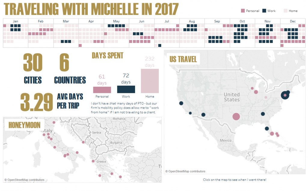
One of my most popular visualizations is a map I created in Tableau, an analytics software tool, to show all of my friends and family all of the places that I traveled to in my year as a consultant. This was my original visualization:

Since I am a technology consultant for my job, I am fortunate that I have quite a bit of experience using Tableau. However, the really great thing about Tableau is that it has a click and drag interface, so no programming skills are necessary! I want to show YOU how you can easily create your own visualization!
I am currently working on an online course to teach you how to create these maps and visualizations. If you would like an email once the course is complete, please leave your email here:
[mc4wp_form id=”1249″]
Until my course is complete, I have already published a guide on my blog: TAF Maps for Tableau Beginners, which assumes that you have never heard of Tableau before and walks you through, step by step, how to visualize your very own map.
TAF Maps for Tableau Beginners
- Travel Maps for Beginners
- Formatting Your Travel Map
2a. Troubleshooting Your Map Errors - Creating Your Map Graphic
You can see an example of the types of maps you can create in Tableau below. This is a calendar and map of places I went to in 2017. Try interacting with it by hovering over the calendar, or clicking on some of the bubbles.


